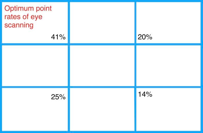


The rule of thirds: a 3 sector grid


The rule of thirds is a simple guideline that designers in art use to align images, text, and components of an image or webpage; they do it in a way that creates balance and is in line with how the viewer’s eye naturally scans the field.
The 3 sector rule - its alternative name - is a method of breaking up an image or design into different equal sections using columns and rows that form a grid. The grid consists of three evenly-spaced rows and columns to make nine equal boxes that fit over the image. An iPhone's camera can automatically impose the grid, but to do this manually, first record the height and width of the image. Once this is done, divide each evenly by three whilst placing marks at the intervals on the top, bottom, left and right sides of the page. Next, draw four straight lines crossing over the intervals: two horizontal and two vertical as the image below shows.

Where the lines in the grid intersect are four crucial points that represent the areas where the human eye naturally falls when viewing an image or design. The asymmetry created by using three columns and rows (as opposed to an even four) follows the innate way people scan a design and makes it easier to create dynamic and pleasing compositions.
It is important to note that use of this grid is advised to be used more as a guideline. However, there are many ways designers incorporate the rule of thirds into their design process. Most commonly, it is employed as a guide for arranging elements, aligning text, and positioning images and icons in a way that the user can easily interpret and digest. The natural asymmetry of the grid creates dynamic designs with a sense of flow as opposed to symmetric ones that suggest stillness and rigidity.
The rule of thirds assists designers in positioning key elements and information. By placing main features and critical details on or close to the four points of intersection, designers can have greater confidence that the viewer’s eye will instinctively notice and flow between them in an effortless and enjoyable way. More specifically, UX designers will place important images, links, text, or calls to action near the four points of the grid so users can quickly get an idea of what they are looking at and how to proceed with main tasks. This makes it easier for the user to accomplish their goal on the site or app in a visually appealing way and without being overloaded by non-essential information.


