

Basic principles of design


There is debate as to how many core principles underpin graphic design, but the following covers the most agreed upon: -


Hierarchy in graphic design utilizes several key principles, including size, color, contrast, alignment, repetition, and brightness to emphasize certain elements of the design. It controls those factors in order to show importance within the design as a whole. By utilizing hierarchy properly, the designer can show users exactly what they want them to pay attention to, keeping their eyes on the most critical element of the piece.
So hierarchical design combines two aspects: dominance and priority, giving extra weight to certain elements of a design over others. It helps convey the underlying message by focusing on a particular element/s of the design. It can be achieved in conjunction with the later principles below, but might be achieved through some examples from a) highlighting the title using large or bold fonts b) placing the key message at a higher level than other elements c) inserting shapes to frame the focal view or d) applying detailed and contrasting visuals.
The attention of viewers is limited, so acknowledging hierarchy in a design will ensure the most significant elements are quickly and easily taken in first.


The principle of scale concerns the use of relative size to signal importance and rank in a composition. When used effectively, this principle can dramatically aid hierarchy by drawing attention to the most important elements by virtue of their relative size compared to other elements.
A visually pleasing design may typically use no more than 3 different elemental sizes. Having a range of differently sized elements will not only create variety within the layout, but it will also place emphasis on them in order of their size. When the principle of scale is used properly and the right elements are emphasised, users will better know where the focal points of a design are.
A variety of scale sizes can also help define tone, tension & interest so it is advisable to incorporate small, medium and large scales for the different design elements.


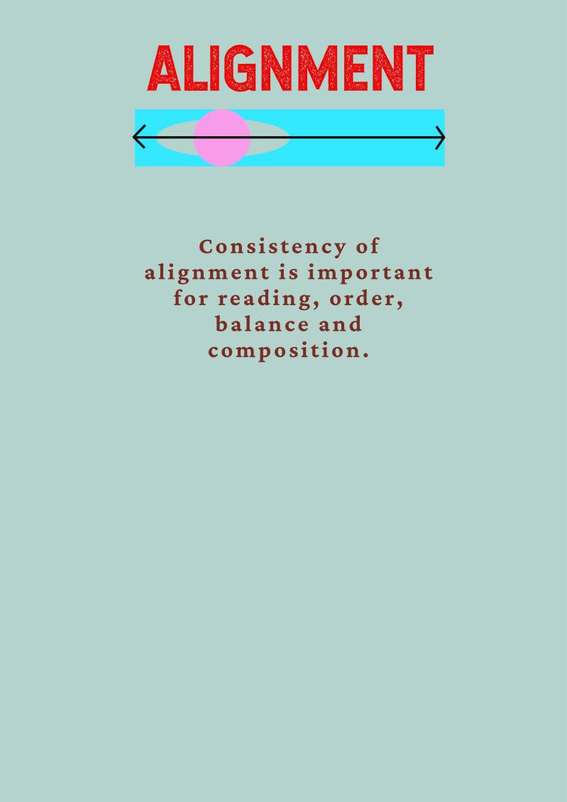
Alignment is important for ensuring a sharp, ordered appearance for more balanced designs, and will give elements a pleasing connection with each other. It is a design principle that refers to the lining up of text or graphics on a page, and is important to give the right impression of competence to the viewer; a design with poor alignment will look cluttered and unfinished.
Consistent and strategic alignment can also aid visual hierarchy in a design, as the designer might align a key item in such a way as to help draw attention to it. For example, they might use the rule of thirds to make a specific element of the design stand out or place the subject of their image at the centre of the design.


Contrast is formed when design elements are placed in opposition on a layout, as with dark & light, thick & thin, new & old and large & small. It is an important principle in any form of visual art, as it guides attention to the key elements of a design such as company or event names; it is therefore a key tool in assisting a design's visual hierarchy.
Use of contrast is also essential for typography when separation and distinction is required between bodies of text; it can greatly enhance a layout’s overall legibility, and provide better retention and comprehension of key items.


A consistent design approach and the repitition of themes and objects can create a pleasing rhythm in a design. This unifies different elements together, whilst also improving organisation and consistency.
Repeating certain elements, like logos or colour, can also aid key things like brand identity by cementing its aesthetics in the viewer's mind. The principle can also assist hierarchy by repeating key patterns or objects over and over; it is the repetition that increases the significance of something by drawing more attention to it.
Consistent rhythm is classified into two types: 1) Fluidity; this adds a significant amount of variation to the design, whilst keeping the flow in a single direction 2) Progressiveness; progressive rhythm is based on a clear sequence which controls the visual movement between different elements.


The proximity of elements in a design aids organization and balance. Ideally, the designer clusters certain elements together so as to help declutter the overall design and support the comprehension of the information.
Keeping items close to one another in the design furthermore shows that they are related and assists visual hierarchy. By placing text next to an image, for example, it will show that the text and image are related. Likewise, placing two elements side-by-side may cause the audience to connect or compare them; this does, however, depend on the design elements themselves and how they are otherwise emphasised.
Proximity also forms a visual connection among important design factors such as colour, font, type or size, and ensures the layout is balanced enough to form an effective design. It enables a more pleasing look of what can be viewed by the audience, thereby helping their understanding of the work.


Balance gives a design its form and stability of visual weight; it helps guide the eye travel through the content in a way that aids comprehension. Balance refers to the distribution of the graphic design elements - like shapes, text boxes and images - within a design, giving a more even feel throughout a certain layout.
A composition is balanced when all objects in it have visual equilibrium; it can be achieved both symmetrically and asymmetrically, and relates to the concept of visual weight. This states that every element in a composition has a perceived weight, and is more apparent when an element is compared to another and one seems to be heavier than the other.
Designers can choose between a balanced (stable) design or off-balanced (dynamic) layout. In the context of graphic design, balance is of three types: -
Symmetrical – This type of design is formed along a vertical axis and or horizontal axis, where the weight of the elements is evenly divided into both sides of the layout.
Asymmetrical – This type of balance employs scale, contrast and colour to even out the flow of a layout. It is usually found in websites, where two sides of a webpage differ from each other but contain similar elements.
Radial– Here, the elements of a design are placed in a circular pattern on the layout. This provides a sense of movement and dynamism to the eyes of the viewer.
Use of balance can also assist visual hierarchy in a design. Indeed, unexpected breaks in a seemingly symmetrical or asymmetrical design can be manipulated by the designer to bring the viewer's attention to it, and place something important there like a call to action button. The use of balance is therefore critical to design, and bears more responsibility than at first may appear.


Color is a powerful design principle because it helps communicate on an emotional and subconscious level. Understanding colour theory is a key advantage to the designer. The colour blue can instil calm or trust, while red riles up emotions and calls for action. Therefore, choosing the right colour can help define the tone of a design.
Good use of colour is a strong tool in establishing hierarchy to the design; bright colours draw the eye and keep the viewer's attention. By emphasizing the color of a specific object or objects, the designer can show that they want the viewer to take note of those items. Sometimes, this can be achieved more subtlely where one specific item is only a little brighter than the others in the frame or the object is a repeated specific colour while others are not. In other instances, colour can be used to dramatic effect: one injection of colour in an otherwise desaturated environment can make a big impact.


Negative or white space can be classified according to its size and use in a particular design. When space is intentionally added to highlight certain elements in the effort to boost visual hierarchy, it is called active white space. On the other hand, for space that is naturally created, like that which exists between words and around fixed object logos, it is called passive white space.
Negative space is furthermore comprised of micro and macro white space. Micro white space refers to small spaces between elements, like the spaces between lines and paragraphs or the spaces between options in a menu. Meanwhile, the entire space around and between major layout elements, like the spaces between content blocks on a website, is called macro white space. It acts as a canvas for all the elements included in the design.
White space both separates and groups elements in a design. It can establish that elements are related to one another, whilst aiding viewers to better organize visual information. This point is therefore connected back to proximity, proving that objects which are placed closer together with less white space tend to be seen as a single unit rather than individual, unrelated parts. By increasing or decreasing space to divide and group elements, viewers will be able to process the information they see in a more logical way.
Using white space to separate blocks of text also makes content easier to read and digest. It improves the readability and legibility of content, and prevents the viewer from being visually overwhelmed, whilst contributing to increased comprehension.
Finally, white space promotes visual hierarchy and helps users easily find the information they are looking for. Larger white space around certain parts of the object in turn places more emphasis upon it. Applying generous white space around headers, headlines, buttons and navigation menus can immediately prompt users to do an action.


